Posts

Showing posts with the label paint

Warm neutrals offer to express the comfort of earthy colours.

Image
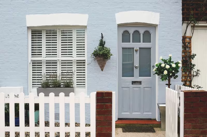
A colour scheme that exudes calmness has a certain quality. Warm neutral colours accomplish just that; they fill your house with cosiness like a cosy blanket. Imagine the creamy tint of your morning espresso or the golden brightness of an autumn afternoon swirling about you. That's the cosy feeling that a warm neutral colour scheme gives your room. The Earthy Colours Association Have you ever had the desire to simply plant your toes in the ground to feel grounded? That is the allure of colours with earth tones. Adding these earthy hues to your house is like creating your own indoor desert or forest; it makes you feel like you're outside wherever you are. Using Nature's Palette for Décor Consider your favourite comfy hiding place in your house. Imagine it now styled with a few gorgeous accessories that pop in warm neutral tones. A throw blanket here, a cushion there—each element adds a layer of "home" and a narrative to your area. And isn't that the whole idea...

Bringing Walls to Life: A Guide to Paint Finishes

Image
Chosen your colors but need some help finding the right paint? Use our quick guide to help you pick the perfect finish for your project. Matt and flat matt emulsion paints offer a velvety texture that is well-suited for interior walls. The smooth consistency of matt emulsion is effective at concealing wall imperfections , while flat matt provides a slightly chalky finish, perfect for achieving a contemporary aesthetic. Emulsion paint assists in maintaining colour consistency even as lighting conditions vary within a room, making it particularly conducive for darker shades such as deep-sea blue or rich eggplant. These finishes offer a slight polish and reflect light, making them ideal for lighter colours. Silk paint is typically applied to walls, while satin is preferred for woodwork. Silk finishes are easy to wipe clean, adding to their practicality. However, they may accentuate imperfections on less-than-perfect walls. Satin finish on woodwork helps mask flaws and imparts a softer col...

Decoding Color: A Simplified Guide to Colour Theory

Image
  Put together perfect colour schemes with our simple guide to colour basics. Recognise the colour wheel The conventional colour wheel can be a helpful tool for arranging essential colours and for creating decorating plans for any kind of project or area. Three primary categories of colour exist: The three primary colours are blue, yellow, and red. These three fundamental components are used to create all other hues. The secondary colour spectrum includes green, violet, and orange. Two primary hues are combined to create each of these colours. Orange is produced by combining red and yellow, violet by combining blue and red, and green by combining blue and yellow. Primary and secondary colours can be combined to create tertiary hues, as can two secondary colours. Magenta and chartreuse (yellow and green) are two examples.  Make up your own colour palette. Once you have these fundamental hues organised on a wheel, you may use three safe colour combinations to create three primar...

Jazzy looking entryway paint tones

Image
 The ideal tone at the perfect spot or protest can never dishearten you. The force of the variety can overhaul even the most dormant spaces. In the event that your room paint plan or door paint tones are likewise projecting a dull impression, the time has finally come to take up the brush and give not many beautiful strokes to your entryways and rooms. "Here some entryway paint tones and room paint configuration are brought before you as an idea and they are as per the following": Blue At the point when you are don't know which room paint plan or entryway paint tone to pick, take a gander at the sky and you will track down motivation. The blue shade of the sky moves you to sprinkle it on your entryway and walls in various shades of white or dark. The loosening up blue gets an inviting impact the temperament of the room alongside tranquility and harmony. Yellow Yellow looks extremely lively and dynamic on walls as well as entryways. High and dim colors of mustard yellow ...